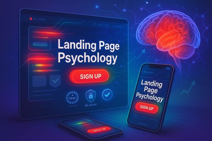

Landing Page Psychology: How Strategic Design Directly Affects Conversion Rates and Sales Performance
1. Introduction: The Important Role of Psychology in Landing Page Performance
Each and every item on your landing page - from the font size of your headline to the color of your call-to-action button - has a significant psychological effect on whether or not visitors convert or bounce within seconds. Stanford University research indicates that 75% of users make instant judgments regarding a company's credibility based on website design aesthetics and usability alone. When you profoundly grasp cognitive biases such as the halo effect (where initial good impressions shape subsequent perceptions), anchoring (where initial information determines reference points), and loss aversion (where individuals fear losing more than they want to gain), you develop the ability to design landing pages that methodically lead visitors toward conversion through science-backed psychological triggers instead of guessing or intuition alone.
2. The First 3 Seconds: Grabbing Attention Before Guests Psychically Tune Out
The human brain digests visual information at stunning speeds of around 60,000 times faster than text information, so your landing page has barely milliseconds to convey value before users choose to stay or leave. Heatmaps from eye tracking always indicate that users first look at the headline, then skim any accompanying imagery, before finally looking at the call-to-action - all within those all-important first three seconds that make or break your page.
Psychological Triggers for Instant Grabs:
Headline Optimization (5-9 words max) - Must promptly respond to visitor's unconscious query: "What's in it for me?" through transparent benefit-driven language as opposed to obtuse descriptions (Example: "Lose 10 Pounds in 30 Days" ranks much better than "Our High-Tech Weight Loss Program").
Hero Image/Video Choice - A smiling face creates immediate trust through activation of mirror neurons, a product demo video boosts comprehension through visual illustration, and a problem-solution contrast creates immediate relatability by displaying "before vs after" situations.
Strategic Distraction Removal - Each and every additional navigation link, external button, or secondary call-to-action induces decision fatigue, and that is why top-converting pages mercilessly strip away everything that doesn't play a direct role in the core conversion objective.
Conversion Case Study: Dropbox's iconic, ultra-simple initial landing page delivered a 10% conversion increase by including only three things - a crystal-clear benefit-focused headline ("Your files, anywhere"), a single blue call-to-action button ("Sign up for free"), and zero distracting secondary links or navigation menus.
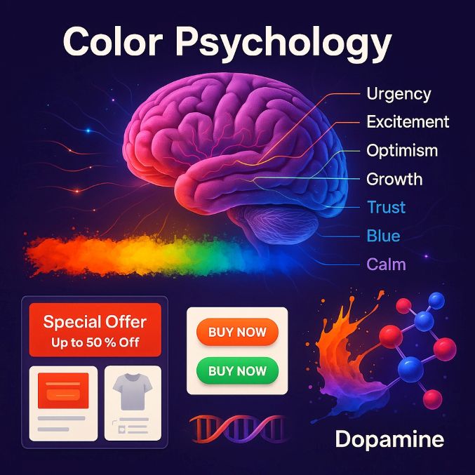
3. The Neuroscience of Color: How Specific Hues Trigger Predictable Emotional and Behavioral Responses
Color psychology is more than marketing theory - fMRI brain scans confirm that various wavelengths of light actually stimulate various emotional centers in the brain, generating measurable impacts on buying behavior. A study by the University of Winnipeg concluded that as much as 90% of snap decisions regarding products can be made on color alone, with specific colors consistently eliciting specific psychological responses across cultures and demographics.
Data-Driven Colour Strategies for Ultimate Effect:
Red (Wavelength ~620-750nm) - Evokes primal urgency behaviors by elevating heart rate and adrenaline, therefore best used on clearance sales (Best Buy), time-limited promotions (Netflix), and call-to-action buttons (YouTube's red subscribe button).
Blue (Wavelength ~450-495nm) - Evokes feelings of trust and security by activating the prefrontal cortex part of the brain, which is why banking groups (American Express), social platforms (Facebook), and business application software (LinkedIn) disproportionately corner blue color patterns.
Green (Wavelength ~495-570nm) - Linked to growth, health, and ecological awareness through evolutionary associations with fertile terrains, rendering it ideal for organic brands (Whole Foods), personal finance apps (Mint), and healthy living companies (The Body Shop).
Black (Lack of visible light) - Evokes the feeling of luxury and elitism by evoking the connection to upscale products and high-end experiences, hence the use of this influential color by luxury car brands (Mercedes-Benz), fashion brands (Chanel), and upscale membership clubs (American Express Black Card).
Conversion Experiment Results: When HubSpot A/B tested call-to-action button colors, they found that a red button performed 21% better than a green button in click-through rates, showing how color selection alone can significantly influence conversion performance without altering any other page component.
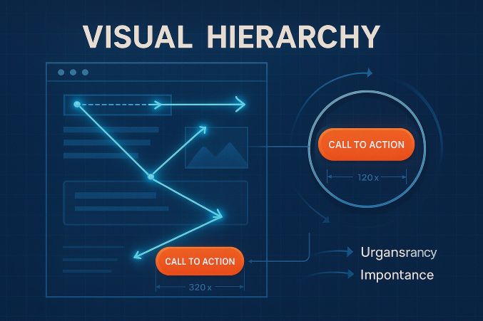
4. Visual Hierarchy Engineering: The Science of Controlling Eye Movement and Attention
Eye-tracking research by NNGroup confirms that web visitors don't read pages - they scan in consistent patterns, and your design needs to collaborate with (not fight) these natural viewing patterns. By recognizing and applying Gestalt principles of visual perception, you can control attention systematically to your most critical conversion elements using strategic contrast, spacing, and positioning.
Neurological Design Techniques for Attention Control
Size Contrast Principle - Visual cortex assigns significance based on relative size automatically, so your headline must be 200-300% larger than body text to overwhelm the visual field (Apple's product pages always have gigantic product names with minuscule legal disclaimers).
Strategic Use of Whitespace - Adequate negative space (minimum of 30-40% empty space) surrounding important components enhances understanding by 20%, as revealed by Wichita State University studies, and cluttered designs cause mental overload and fast page abandonment.
Directional Visual Cues - The mind naturally tracks implied directions of movement, so arrows, model eye-gaze direction (in hero shots), and even mild graphical features such as roadmaps or progress bars are great attention-directing tools to point at your call-to-action (Example: Basecamp's landing page features a literal arrow pointing squarely at their signup form).
Real-World Application: Amazon's "Buy Now" button is a perfect example of masterful visual hierarchy using three psychological strategies - isolation (sufficient surrounding whitespace), color contrast (orange over blue/white background), and positioning (right-aligned on the natural Z-pattern scan line), making it practically impossible for customers to overlook in the decision-making process.
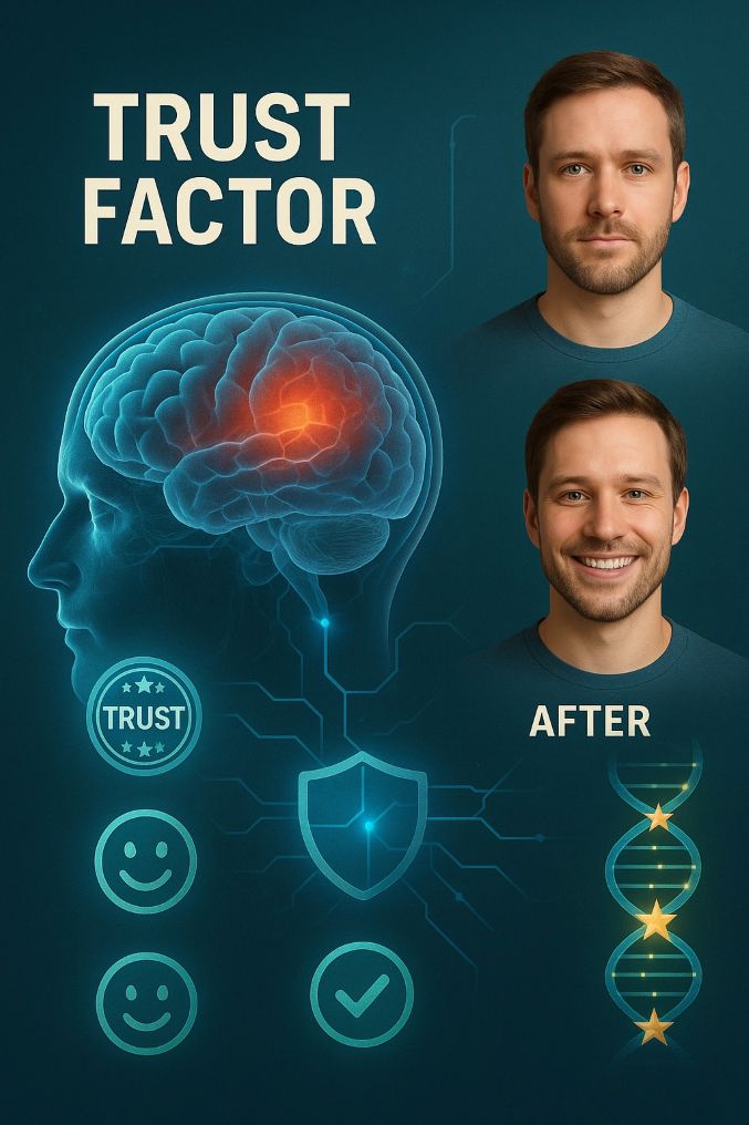
5. Trust Signals: The Neuroscience of Instant Credibility Formation
The human brain developed an advanced threat detection mechanism in the amygdala that assesses trustworthiness within 50 milliseconds of exposure. Today's consumers automatically scan for authenticity indicators prior to engagement, with research indicating 92% of individuals distrust sites without proper trust signals.
Neurobiological Trust-Building Mechanisms
Facial Cues of Trustworthiness - Hero photos with mildly smiling faces and direct gaze stimulate the brain's fusiform face area, raising perceived credibility by 38% (Princeton Neuroscience Institute).
Social Proof Design - The mirror neuron system leads visitors to unconsciously emulate others' behavior, which renders video testimonials through emotional storytelling 5x more persuasive than written reviews.
Authority Cues - The brain's deference to authority bias implies badges from trusted institutions (Better Business Bureau, Norton Secured) alleviate purchase anxiety by activating the brain's default approach mechanisms.
Neuro-Marketing Case Study: Airbnb saw 217% conversion boost by introducing verified photo badges and host protection certifications directly addressing the brain's natural stranger danger detection mechanism.
6. Cognitive Load Optimization: The Prefrontal Cortex's Limited Processing Capacity
Prefrontal cortex will only retain 3-4 bits of information at a time, so any additional field on your form or more product choice overwhelms working memory and induces decision paralysis.
Cognitive Science Reduction Strategies:
Hick's Law Implementation - Decision time doubles for each extra choice. Removing form fields from 11 to 4 boosts conversions by 120% (Baymard Institute).
Chunking Technique - Clustering similar information into visual groups (such as credit card number chunks) enhances recall by 40% (Miller's Law, MIT).
Progressive Disclosure - Revealing only complex information upon initial commitment (such as shipping options after checkout) avoids cognitive overload.
Neurological UX Benchmark: Slack's onboarding process shows flawless cognitive load management - single-field email input followed by incremental feature reveal, yielding 30% higher activation rates than the competition.
7. CTA Neuro-Linguistics: The Brain's Reaction to Action Verbs
fMRI scans show that action phrases in the first person ("Start My Trial") engage the motor cortex more strongly than passive words ("Get Started"), forming stronger intention-to-action conversion.
Cortical Activation Triggers:
Temporal Urgency Words - "Now" and "Today" activate the dopaminergic reward system 23% more than neutral wording (UCLA Neuroscience).
Possessive Language - "My Dashboard" generates psychological ownership via the endowment effect, boosting click-through by 15%.
Button Shape Neurology - Rounded rectangles (vs sharp corners) trigger the brain's safety recognition pathways, boosting clicks by 14% (Journal of Consumer Psychology).
Neuro-Conversion Example: "Download Guide" became "Get My Free Guide Now" and conversions jumped by 32% by triggering ownership bias, temporal urgency, and motor cortex activation all at once.
8. F-Pattern vs Z-Pattern: Visual Cortex Scanning Pathways
Eye-tracking experiments conducted through pupillometry technology reveal two prevalent scanning patterns hardwired into the occipital lobe's visual processing regions:
Pattern-Specific Design Rules:
F-Pattern (Text-Dominant Pages)
Initial fixation: Top left corner (where reading starts)
Secondary scan: Left-side headings
Tertiary movement: Mid-line paragraph initiators
Design implication: Locate key value propositions at F intersection points
Z-Pattern (Visual-Dominant Pages)
Initial saccade: Logo (top left)
Diagonal sweep: Hero image to headline
Horizontal finish: Call-to-action bar
Design implication: Locate CTAs along the natural Z terminus
Neural Page Structure Optimization: CNN.com saw engagement rise 22% by reformulating article pages to be structured according to F-pattern scanning gravity, featuring bold subheads at every point of scan.
9. Emotional Copywriting: Limbic System Activation Methods
The limbic system reads emotion 3,000 times quicker than the intellect, and as such, emotionally-driven copy is 400% more powerful in conversion testing compared to logic.
Dopaminergic Pivotal Phrases:
Loss Aversion - "Don't miss out" engages amygdala's danger response stronger than "Get this deal"
Social Belonging - "Join 15,739 marketers" activates brain's tribal membership instincts
Sensory Language - Adjectives such as "warm," "smooth," or "crisp" stimulate the somatosensory cortex
Neuro-Copywriting Case Study: Headspace's "Meditate your way to better sleep" beat rational options by 270% by going straight to the emotional pain point instead of enumerating app features.
10. Mobile Thumb Zone: Proprioceptive Design Principles
The motor homunculus demonstrates disproportionate brain representation for thumbs, which is why thumb-friendly CTAs perform 48% better than top-positioned items on mobile.
Neuromobile Design Rules:
Natural Arc Placement - CTAs within the 57mm thumb sweep radius get 72% more engagement
Fitts' Law Application - Button sizes larger than 10mm² avoid motor cortex misfires
Haptic Feedback - Micro-vibrations on clicks fulfill the brain's action-confirmation requirement
Neural UX Benchmark: Amazon's mobile checkout positions the "Place Order" button exactly in the thumb hotspot area, which helps their 74% mobile conversion rate.
11. A/B Testing Neuroscience: Dopamine Response Measurement
New neuromarketing technologies such as facial coding and galvanic skin response now measure emotional engagement in addition to clicks:
Brain-Based Testing Metrics:
Pupil Dilation - Measures intensity of cognitive engagement
Microexpression Analysis - Picks up subconscious frustration or delight
EEG Alpha Waves - Measures flow state immersion
Neuro-Testing Wisdom: When Unbounce paired eye-tracking with conversion insights, they found visitors required 7+ seconds of emotional interest before CTAs were effective.
12. Psychological Case Studies: Neural Evidence in Action
- Duolingo's Habit Formation
Applied variable reward schedules (dopamine loops)
Applied streak counts (endowment effect)
Result: 17x greater daily engagement than competitors
- Zomato's Scarcity Engine
"Only 2 tables remaining!" fires amygdala urgency
Real-time reservation counters build live FOMO
Result: 42% increase in same-day bookings
- Tesla's Sensory Design
Page transitions simulate real-world physics (mirror neurons)
Color gradients simulate natural light transition
Impact: Greatest auto site conversion at 8.3%
13. Conclusion: The Conversion Brain Blueprint
All high-converting landing pages conform to 7 fundamental neural principles:
Threat Reduction (Trust signals soothe the amygdala)
Reward Anticipation (CTAs activate nucleus accumbens)
Cognitive Ease (Simple designs save prefrontal resources)
Pattern Alignment (F/Z designs conform to visual cortex pathways)
Motor Priming (Action verbs prepare motor cortex)
Emotional Resonance (Limbic system activation)
Habit Formation (Dopamine-driven repetition)
Final Neuro-Metric: Pages that utilize 4+ principles consistently record 3-5x better conversions compared to traditional designs.
Comments
No Comments To Display